I’ve waxed on and on in the past few months about the coming joy of Windows 8. Keep an eye out in October if you haven’t already downloaded the Consumer Preview and familiarized yourself with it. I’ve waxed on and on in the past few months about the coming joy of Windows 8. Keep an eye out in October if you haven’t already downloaded the Consumer Preview and familiarized yourself with it.

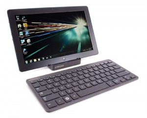
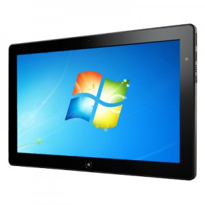
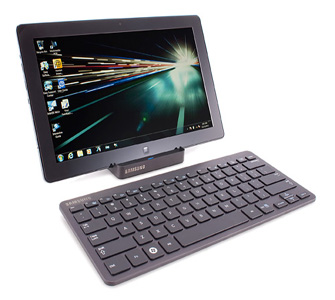
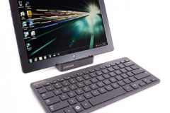
Recently though I got my hands on the Samsung Series 7 Slate, a Windows 8 based touch tablet that is a gadget that Windows 8 was actually made to be experienced on. In my opinion, Windows 8 does little for the laptop or desktop experience of the new Windows. It actually just takes what is already familiar to us and moves it around. And that’s quite annoying. But once you’ve played with it for a short while you’ll have quickly clued yourself up and life will march predictably on.
On the mobile device though, Windows 8 is a whole new experience. This is what Windows 8 was made for and where it should really be experienced.

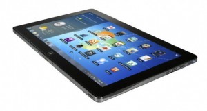
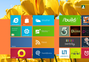
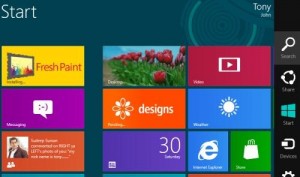
If you’ve got a Windows Phone 7 device or have played on a friend’s one, then you’ll be familiar with the live tiles. Each representing a different app on your device, but you can also add websites, contacts, documents and more to the home screen.
Navigating the home screen or what they call the “Metro” screen is incredibly simple and intuitive, and unlike the iPad lacks any sliding structure or boxed in screens. It successfully plays on your natural desire to just slide things across, and bumps into the edge in a fun way.
Personalizing the Metro screen is also very simple, and proving my point that Windows 8 is better on mobiles, much easier than it is on a desktop.

Each side of the screen provides a different function to you. Slide in from the top and you bring in functions of the app you’re in. In from the right and you bring in search, settings and more. And my personal favorite, from the left and you scroll through open apps. This is a big one for someone who works a lot on an iPad and is sick of having to close down an app to go search online just to have to return to the app you were in.
Again Windows have a lot of work to do in their store. It’s empty than George Bush’s head, but as I mentioned here they’re working hard to get it full in time for the October launch. Some very attractive deals are available for developers.
Natively there are a bunch of apps available, but like any new Android phone, you probably won’t use most of them, relying rather on the apps you’ve become accustomed to using. A good example was VLC media player which is a standard first choice for media junkies like me.
They do include a great looking music app on the Series 7 Slate, that displays album information, adapts to the screen and makes you feel like you’re actually enjoying seeing the music too. However, it’s quite a chore to add music to the collection at first go, especially if your music is on a USB drive in the port. There’s also no “open with” native music player function with means you simply land up dragging and dropping it in to VLC.

The screen on the Series 7 Slate is phenomenal and grand. At 11.6-inches it’s about the same size as a small laptop, and it’s made by Samsung, so there you go.
Responsiveness is unrivaled thanks to the Intel Core i5 Processor onboard, and the speaker system is really not bad. Most of the time you’ll be using headphones anyways.
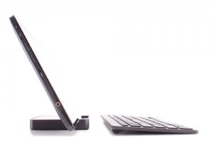
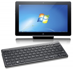
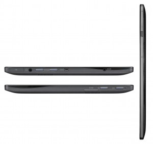
The inclusion of a USB port as well as a micro-SD slot is a welcome addition because you’ve only got 64GB on the onboard SSD. Also though, you’re likely, and more importantly, able to pair the Series 7 Slate up with a Bluetooth keyboard and docking station. This means it really is an alternative to the traditional laptop. Although, if this is your plan maybe it’s worth waiting for the Microsoft Surface to come out.

Speaking of the keyboard and dock, you’re going to want to keep these handy. The Slate is a bit bi-polar. When you’re on the Metro screen, sliding through apps and acting like it’s a tablet, life is vacation-like.
However, when you hit the desktop and are now working on a traditional Windows screen, things get a bit tricky and small, and you’re going to be grateful for the keyboard and mouse.
Most fingers are going to be a bit clumsy on the quite small icons of Windows. Our fingers weren’t made for accurate pointing on a silky smooth screen, and this gets quite frustrating.
At the end of my play, I couldn’t help but wonder what I would say if someone asked me if I would recommend the Slate as a total laptop replacement. Turns out, I would.
Sure you wouldn’t be getting the same hardware spec or toughness and protection of a laptop, but if your job involves a lot of typing, even more surfing, maybe a little bit of design and the need to take your screen from desk to boardroom presentation, then this is a brilliant choice for you. You’ll need to be OK being called an “early adopter”, and not mind know-it-alls judging you because you opted for the Windows 8 Slate and not an iPad, but go on with your nerdy self!
Get it: www.samsungonlinestore.co.za/p-128-samsung-series-7-slate-pc.aspx#undefined
For: R14 200
