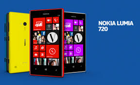
It’s Nokia’s new mid-range flagship device and they’ve won the branding lottery thanks to a partnership with the next big thing, the Man of Steel. How does the phone stack up against its superhero brother?
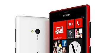
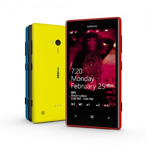
Straight off the bat, the Lumia 720 is a great device, purely thanks to its price-point of around R5 400 and all they’ve crammed into it for that. This is middle of the range and for it you get stunning unibody build quality and a 4.3″ ClearBlack WVGA Super Sensitive LCD screen protected by Gorilla Glass 2. It’s even usable while wearing gloves.
The phone feels sturdy and smooth in your hands and while this is nice, there is an element of clumsiness while running around the Windows 8 OS playground, but that’s the same on the bigger Samsung Galaxy 4 so…
While on the subject, let’s get it out of the way, Windows 8 is still lacking in quite a few apps, and this is annoying. However, this isn’t a reason not to buy this phone. It’s a good price for what you get and it’s a statement to those around you that you walk your own path.
It’s very annoying looking for a quite common app only to be confronted with a bevy of second or third class, border-line spam apps without actually finding what you’re looking for. Nokia need to get this under control.
Other things I like: they’ve included the great 2000 mAh battery from the Lumia 920 which means you’ll seldom want for battery life and even though it’s only got a 6.7MP camera, it’s a joy to work with and you find people peering over your shoulder more often than with another brand.
And now some crit, and there’s no other way to say this: they’ve put the “power” button in the wrong place again. Staring at the phone with it in your left hand, your middle finger is going to fall smack on the “power” button. This makes sense until you have to actually use the phone which finds you continuing your game of “chicken” with the phone thanks to the slightest of delays in switching the screen off and on again. Seriously, they just need to move the button higher.
I could never really put my finger on why I like the Windows marriage to Nokia so much (aside from the look and feel) until I got done with the Nokia Lumia 720. If you want a safe phone that’s going to remind you of the way phone screens and the old styles of Windows have looked for the past 15 years, get a Samsung or other Android powered device. Everything looks the same, icons are just right, movement is as you’d expect, and that’s fine if all you want is normal. But if you’re one of those people who spent history class doing majestic doodles on your school desk, then the Windows 8 OS is for you. It’s about unnecessarily large icons and taking that extra one step to get somewhere. It’s about two-tone in your life and flashy color combinations as well. It’s about a video camera with display numbers large enough to read from across the room. Don’t be scared embrace it.
But embrace it knowing you will be a little left out or at least a little annoyed with what you can’t do in the apps space.
Here’s some specs:
OS: Windows Phone 8
Processor: Qualcomm Snapdragon S4 1GHz
RAM: 512MB
Storage: 8GB + 7GB Cloud + micro SD up to 64GB
Screen: 4.3in WVGA 800 x 480
Connectivity: WLAN IEEE 802.11 b/g/n, Bluetooth 3, NFC
Others: Magnetometer, A-GPS, A-GLONASS
Dimensions: 128 x 68 x 9mm (WxDxH)
Weight: 128g

