The post Nokia Lumia 820 GADGET REVIEW appeared first on Reviews of the latest gadgets and cars - AskSteve.co.za.
]]>The only way to tell most of these devices apart is to compare the few things that vary. Things like design, battery life and onboard camera. There’s also native developer apps that add a bit of flavour, and Nokia’s well known for these.
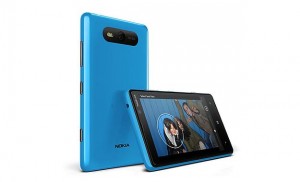
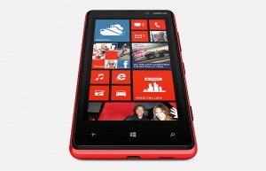
In the design department, the Nokia Lumia devices are really tops. Smooth, thin and accessible buttons all score high for the new 820. It takes a bit of getting used to holding it in your hand, and you’ve got to train yourself to stop pushing the screen lock button on the side, but once you do, you’re on your way.
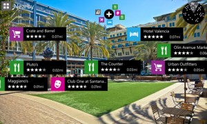
The onboard Nokia apps are a big selling point of the new Lumia 820. Two in particular quickly transform from “nice to haves” in to “essentials”. Nokia City Lens is an augmented reality app that guides you around your surroundings by holding the phone up and telling you what’s near to you. Transport, shops, restaurants and more. When I first played with this sort of app it was years ago on something called Layar, and the South African landscape had not been adequately populated to say the least. Now there’s more than you can imagine on City Lens. A nice add on.
Nokia Drive is no more than Nokia’s navigation app, but it’s good and takes as much advantage of the magnificent 4.3-inch screen as it can. It’s idiot-proof and makes it easy to find locations and POIs. Much easier than the iPhone native app.
Here comes the but…
All is well in the world of the Lumia 820, until about lunch time when you realise that you charged your phone all night, have used it moderately in the morning and you now have half if not less of the battery left to get you through the day. Not a problem if you’re constantly in the office or driving in the car where you can charge, but what if you’re not. They do have a “battery save” setting, but it does little to save you the hassle. The Lumia 820′s battery is rubbish, and that’s a biggie.
And a pity, because the rest of the phone will have you shirking off meetings and ordering that extra coffee while you discover what each live tile does and how to lock your kids out of your phone using the brilliant phone lo-jacking app Kids Corner. The music experience on the Lumia 820 is untouchable and once you find a game worth playing your day is done.
Once you’re over the apps, there’s the extremely capable 8MP camera to keep you busy and drain what’s left of the battery. Coupled with the awesome large screen, and you have your mobile camera solution sorted.
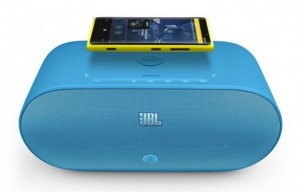
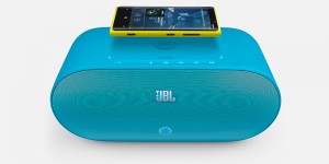
I’ve had a long relationship with Nokia in the past, and one of my favorite elements of the Nokia brand are their accessories and partnerships which bring us great accessories. Case in point, the JBL X PowerUp which I got a play with while reviewing the Lumia 820. The brilliance of this accessory lies in it’s ability to take advantage of two technologies that the Lumia 820 affords you, technologies it’s worth mentioning, that you won’t find on the new iPhone.
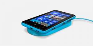
Near Field Communication you already know about. Tap the phone to the top of the JBL Powerup, and instantly your music is streaming wirelessly through the portable, and brightly colored, speakers. But now what do you do with your device while it streams. Well you put it on top of the speakers in the charging pad to wirelessly charge and forget about.
The brilliance of wireless charging is here, and while it still has a long way to go before it solves all the practical issues we consumers live with in our real lives, the first step has been taken. Sure you can’t take the speaker with you everywhere you go or charge at a normal outlet, but it’s wireless charging for god’s sakes. Remember the days of the Nokia bricks? Now say thank you!
The biggest problem Microsoft and Windows 8 have to solve is their skint app store. There just aren’t any. At launch late last year Microsoft proudly told us they had 46 of the most used 50 apps in their store. Skype, Whatsapp, Angry Birds and the like are all there. But common apps like Hootsuite, Fifa Soccer and other quite popular apps are nowhere to be found. At least not yet.
This isn’t enough for me to say “don’t get a Windows Phone”. The apps will come, in time, and when they do this OS will be a serious competitor. No, scratch that. It already is!
Get it: R6 000
From: www.nokia.co.za
The post Nokia Lumia 820 GADGET REVIEW appeared first on Reviews of the latest gadgets and cars - AskSteve.co.za.
]]>The post Samsung Series 7 Slate FULL REVIEW appeared first on Reviews of the latest gadgets and cars - AskSteve.co.za.
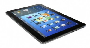
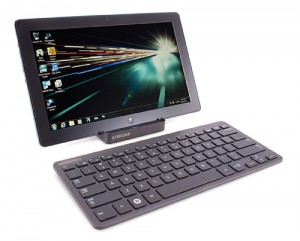
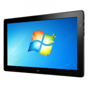
]]>Recently though I got my hands on the Samsung Series 7 Slate, a Windows 8 based touch tablet that is a gadget that Windows 8 was actually made to be experienced on. In my opinion, Windows 8 does little for the laptop or desktop experience of the new Windows. It actually just takes what is already familiar to us and moves it around. And that’s quite annoying. But once you’ve played with it for a short while you’ll have quickly clued yourself up and life will march predictably on.
On the mobile device though, Windows 8 is a whole new experience. This is what Windows 8 was made for and where it should really be experienced.
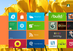
If you’ve got a Windows Phone 7 device or have played on a friend’s one, then you’ll be familiar with the live tiles. Each representing a different app on your device, but you can also add websites, contacts, documents and more to the home screen.
Navigating the home screen or what they call the “Metro” screen is incredibly simple and intuitive, and unlike the iPad lacks any sliding structure or boxed in screens. It successfully plays on your natural desire to just slide things across, and bumps into the edge in a fun way.
Personalizing the Metro screen is also very simple, and proving my point that Windows 8 is better on mobiles, much easier than it is on a desktop.
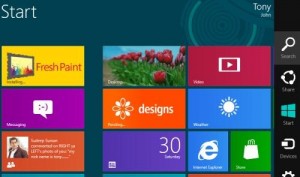
Each side of the screen provides a different function to you. Slide in from the top and you bring in functions of the app you’re in. In from the right and you bring in search, settings and more. And my personal favorite, from the left and you scroll through open apps. This is a big one for someone who works a lot on an iPad and is sick of having to close down an app to go search online just to have to return to the app you were in.
Again Windows have a lot of work to do in their store. It’s empty than George Bush’s head, but as I mentioned here they’re working hard to get it full in time for the October launch. Some very attractive deals are available for developers.
Natively there are a bunch of apps available, but like any new Android phone, you probably won’t use most of them, relying rather on the apps you’ve become accustomed to using. A good example was VLC media player which is a standard first choice for media junkies like me.
They do include a great looking music app on the Series 7 Slate, that displays album information, adapts to the screen and makes you feel like you’re actually enjoying seeing the music too. However, it’s quite a chore to add music to the collection at first go, especially if your music is on a USB drive in the port. There’s also no “open with” native music player function with means you simply land up dragging and dropping it in to VLC.
The screen on the Series 7 Slate is phenomenal and grand. At 11.6-inches it’s about the same size as a small laptop, and it’s made by Samsung, so there you go.
Responsiveness is unrivaled thanks to the Intel Core i5 Processor onboard, and the speaker system is really not bad. Most of the time you’ll be using headphones anyways.
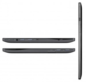
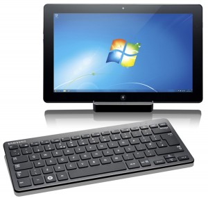
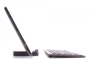
The inclusion of a USB port as well as a micro-SD slot is a welcome addition because you’ve only got 64GB on the onboard SSD. Also though, you’re likely, and more importantly, able to pair the Series 7 Slate up with a Bluetooth keyboard and docking station. This means it really is an alternative to the traditional laptop. Although, if this is your plan maybe it’s worth waiting for the Microsoft Surface to come out.
Speaking of the keyboard and dock, you’re going to want to keep these handy. The Slate is a bit bi-polar. When you’re on the Metro screen, sliding through apps and acting like it’s a tablet, life is vacation-like.
However, when you hit the desktop and are now working on a traditional Windows screen, things get a bit tricky and small, and you’re going to be grateful for the keyboard and mouse.
Most fingers are going to be a bit clumsy on the quite small icons of Windows. Our fingers weren’t made for accurate pointing on a silky smooth screen, and this gets quite frustrating.
At the end of my play, I couldn’t help but wonder what I would say if someone asked me if I would recommend the Slate as a total laptop replacement. Turns out, I would.
Sure you wouldn’t be getting the same hardware spec or toughness and protection of a laptop, but if your job involves a lot of typing, even more surfing, maybe a little bit of design and the need to take your screen from desk to boardroom presentation, then this is a brilliant choice for you. You’ll need to be OK being called an “early adopter”, and not mind know-it-alls judging you because you opted for the Windows 8 Slate and not an iPad, but go on with your nerdy self!
Get it: www.samsungonlinestore.co.za/p-128-samsung-series-7-slate-pc.aspx#undefined
For: R14 200
The post Samsung Series 7 Slate FULL REVIEW appeared first on Reviews of the latest gadgets and cars - AskSteve.co.za.
]]>The post Windows 8 Wedge Mouse and Keyboard and a closer look at Windows 8 appeared first on Reviews of the latest gadgets and cars - AskSteve.co.za.
]]>Well actually the wait is already over because you could have been playing on Windows 8 for months now if you had downloaded their consumer preview.
Either way, part of their preparations includes the release of these two new peripherals which are custom-made with Windows 8 in mind.
Since Windows 8 will be running on multiple platforms, touch, desktop and mobile, any accessories to it need to make the experience identical on each. And that’s where the Bluetooth-enabled Wedge mouse and Wedge keyboard are headed.
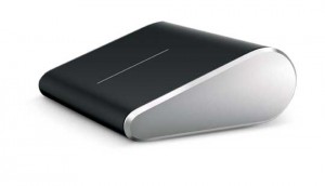
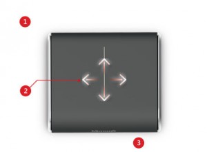
The Wedge mouse incorporates finger swipes, finger zooming and movements for switching between apps on the screen. The idea being to replicate the experience of touch on your desktop mouse.
Two finger swipes to switch among open apps, three fingers to zoom in and out, or a thumb gesture to go backward and forward inside apps.
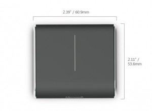
The tiny mouse also features BluTrack technology helping it work on multiple surfaces and has “Backpack Mode” which powers the mouse down when the PC it’s paired to turns off.
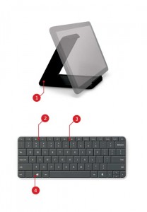
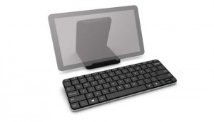
Although the Wedge Mobile Keyboard is designed for use with a tablet, it also works as a full-size PC keyboard. Windows 8 hot keys, media keys, Bluetooth connectivity and a cover all included.
The keyboard also has a slot-in that keeps your tablet upright.
We also had a brief walkthrough of Windows 8 by one of the main developers on the project, and excitement amongst nerds has never been higher. Seriously, never have the numbers on online RPGs been lower. It’s bad.
The developer showed off some of the main principles and experiences of Windows 8:
It’ll always be delivering content to the user. The Windows 8 live tiles take care of that.
A pervasive customization of experience across multiple types of devices. In other words, when you change your display skin on one device, all the devices you’re logged in to with your Windows Live ID feel and reflect the change.
Fast and fluid is foremost. This is a bit conceptual, but they’re trying to make something that makes the user feel like they’re always in control and empowered. If not the user feels something wrong with them. I know.
Photo password login. Awesomeness.
The previous Windows was a pathway to apps, new one isn’t. Instead “Start” is a location where apps can deliver information.
Live edges are king. Swipe in or bury your mouse in any of the edges and either your open apps or search buttons show up. Search is a bit dof though. You have to type in what you’re looking for, then if it’s an app, a setting or a file. One step too many in a world of instant search.
Windows 8 protects you against metered networks. IOW, if you’re using a slow connection or a connection that’s not uncapped, it knows not to download any big files or updates. It’ll also switch immediately to low res videos for you.
The store is meager at the moment, but they promise they’re working with app developers to get it ready by October. Reviews in the store are highly important and empowered, and they’re making it much, much easier to uninstall unwanted apps. Simple pull down and it’s gone.
App developers keep 70% of revenue. 805 if they bring in more than $25 000
The post Windows 8 Wedge Mouse and Keyboard and a closer look at Windows 8 appeared first on Reviews of the latest gadgets and cars - AskSteve.co.za.
]]>