Microsoft is getting itself ready to unleash some Windows 8 love upon the world, and come 26 October, the wait will be over.
Well actually the wait is already over because you could have been playing on Windows 8 for months now if you had downloaded their consumer preview.
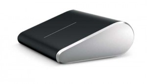
Either way, part of their preparations includes the release of these two new peripherals which are custom-made with Windows 8 in mind.
Since Windows 8 will be running on multiple platforms, touch, desktop and mobile, any accessories to it need to make the experience identical on each. And that’s where the Bluetooth-enabled Wedge mouse and Wedge keyboard are headed.
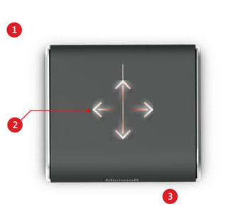
The Wedge mouse incorporates finger swipes, finger zooming and movements for switching between apps on the screen. The idea being to replicate the experience of touch on your desktop mouse.
Two finger swipes to switch among open apps, three fingers to zoom in and out, or a thumb gesture to go backward and forward inside apps.
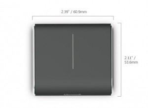
The tiny mouse also features BluTrack technology helping it work on multiple surfaces and has “Backpack Mode” which powers the mouse down when the PC it’s paired to turns off.
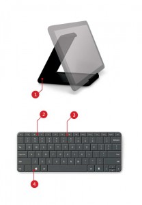
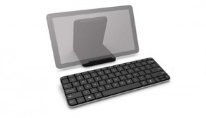
Although the Wedge Mobile Keyboard is designed for use with a tablet, it also works as a full-size PC keyboard. Windows 8 hot keys, media keys, Bluetooth connectivity and a cover all included.
The keyboard also has a slot-in that keeps your tablet upright.
We also had a brief walkthrough of Windows 8 by one of the main developers on the project, and excitement amongst nerds has never been higher. Seriously, never have the numbers on online RPGs been lower. It’s bad.
The developer showed off some of the main principles and experiences of Windows 8:
It’ll always be delivering content to the user. The Windows 8 live tiles take care of that.
A pervasive customization of experience across multiple types of devices. In other words, when you change your display skin on one device, all the devices you’re logged in to with your Windows Live ID feel and reflect the change.
Fast and fluid is foremost. This is a bit conceptual, but they’re trying to make something that makes the user feel like they’re always in control and empowered. If not the user feels something wrong with them. I know.
Photo password login. Awesomeness.
The previous Windows was a pathway to apps, new one isn’t. Instead “Start” is a location where apps can deliver information.
Live edges are king. Swipe in or bury your mouse in any of the edges and either your open apps or search buttons show up. Search is a bit dof though. You have to type in what you’re looking for, then if it’s an app, a setting or a file. One step too many in a world of instant search.
Windows 8 protects you against metered networks. IOW, if you’re using a slow connection or a connection that’s not uncapped, it knows not to download any big files or updates. It’ll also switch immediately to low res videos for you.
The store is meager at the moment, but they promise they’re working with app developers to get it ready by October. Reviews in the store are highly important and empowered, and they’re making it much, much easier to uninstall unwanted apps. Simple pull down and it’s gone.
App developers keep 70% of revenue. 805 if they bring in more than $25 000

